our editing decisions
fonts and TRANSITIONS
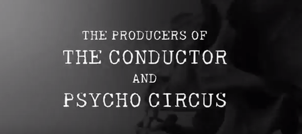
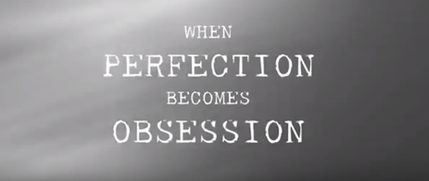
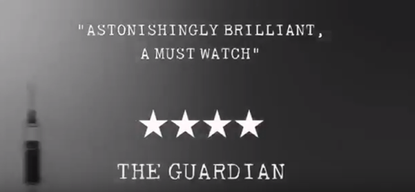
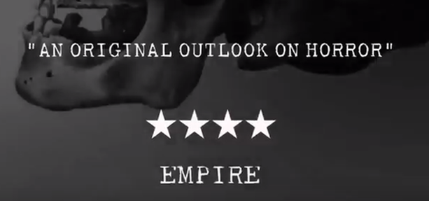
we decided to keep all of our fonts in black and white, we did not want them to stand out too much and take away from the imagery in the trailer. These colours are also still sinister enough to be related to a horror trailer therefore it works well. In all of the font 'scenes' we used a moving image in the background. We chose to use these specific clips as they relate to out trailer and have the same theme as needles and skull can be seen, showing the aspect of death and hospitals.
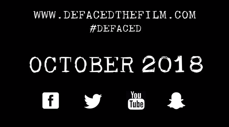
As well as the above we made a conscious decision to have the fonts in this order; we felt as if it was important that the audience first know what other films our group has produced to ensure brand recognition. Followed by this was a quote that related to the trailer to ensure the audience understood what was happening, then movie reviews to further entice the audience into watching it . The end titles show the name of the trailer in a bigger font and then the main information about the film, we chose to put this last as we wanted the audience to retain the information so they would be more likely to watch it.
|
|
|
|
In between all the clips of the trailer and titles we used a transition effect to make sure it had a smooth transition, this also highlighted the difference between the slower clips and fast pace clips towards the end. This also helped the trailer to not feel rushed and overall made it look more professional.
transitions between clips
in the slower pace clips at the start of the trailer we used a transition so that a smoother slower pace was created, however towards the end we did not use transitions, This was done as we wanted the clips to be fast paced and a transition would have ruined the effect. Furthermore to create the effect of a photograph being taken towards the start of the trailer we edited it with a white frame in between scenes, this was quick and gave the effect as it a photo was being taken.
effects
|
We used the same effect through out our trailer, this helped to keep the trailer looking professional and does not confuse the audience between different scenes. We used a blue cool tone effect, this helped create a chilling effect and made the characters more pale. This was the best effect to use as it gave both the chacheter and the locations a more sinister effect. This also helped darken the outside scenes giving it more of a gloomy horror effect.
|
