The purpose of a magazine cover
The sole purpose of a magazine cover is to advertise a film. The way in which magazine companies do this is through a series of codes and conventions, all aimed to catch the audience's attention and ultimately get them to watch the film they are advertising. These codes and conventions that magazine covers abide by are the following -
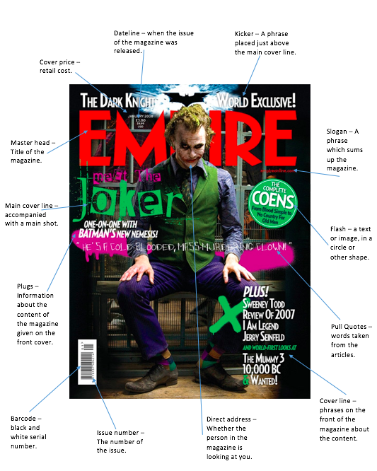
Master head - This is normally located at the top of the cover and is the biggest font size on the page. The purpose of a masthead is to identify the company and reflect the audience it caters for. Some examples are 'Empire' and 'Vogue'.
Image - The main image is usually a mid shot and is designed to express what the film being advertised is all about. It usually features the main character of the film and aims to reflect the genre.
Colour - A variety of harmonising colours are important to capture the audience's attention.
Buzz words - These are the words designed to catch the audiences attention such as 'free' or 'exclusive'. This entices the audience into buying the magazine.
Anchorage text - This is text which usually overlaps the image. This could be a quote or some kind of insight to what is inside of the magazine. Once again this entices the reader.
Banner - This gives more context to the magazine and provides an insight into what is inside.
Barcode, date, issue number - These are necessities for the cover of the magazine, every issue must require this.
analysing real magazine covers
|
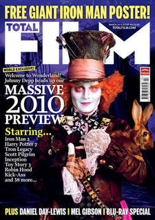
A large master head is located at the top of the magazine cover to clearly state what the brand of the magazine is, in this case 'FILM'. The main image is the main character, the Mad Hatter is located in the middle of the cover, the bright colours of the Mad Hatter draws the audiences attention and draws them in - making them want to watch the horror. A variety of colours are used, the purple background is dark meaning it captures the horror theme, but it us also bright enough to contrast with the Mad Hatters white face. The buzz words 'WORLD EXCLUSIVE' are also used to capture the audiences attention and make them want to watch the film or read the magazine as they feel like they are watching an exclusive and important film. There is a large amount of anchorage text across the magazine cover for example "PLUS DANIEL ..." this once again makes the audience want to read the magazine and find out more inside.
|
|
|
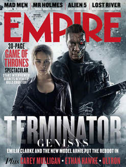
The master head is located at the top of the magazine cover, this magazine is 'EMPIRE'. The colour of the masthead is red which could possibly signify blood or death as the genre of this particular film which is action. This could be foreshadowing what is going to happen in the film. The main image is of two people looking very serious, the man at the back is holding a gun which represents key themes such as violence. Dark colours such as grey tones are used which contrast to the red titles. Much like the previous magazine cover, there is anchorage text across the image to give more of insight as to what is in the magazine. There is no clear barcode on this magazine cover as it is possible located on the back of the magazine.
|
|
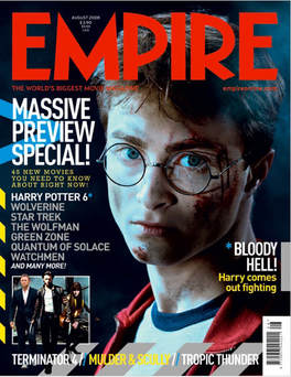
This magazine cover is for Harry Potter. The large red master head clearly shows that the magazine is Empire. The colour red could symbolise blood and death, foreshadowing key themes in Harry Potter. The main image is of Harry Potter, the main character, he is shown with a serious look with cuts and grazes on his face which once again foreshadows what could be happening in the film. Daniel Radcliffe being a popular actor entices the audience and make them want to read whats inside of the magazine. There is also a smaller image which is a glimpse of what else is inside of the magazine. The buzz words 'MASSIVE PREVIEW SPECIAL' captures the audiences attention, enticing them into buying the magazine. Anchorage text is shown on the left hand side, giving information on what page the article about Harry potter is on, making is accessible. A barcode is displayed at the bottom of the magazine cover which is of course a necessity.
|
|
|
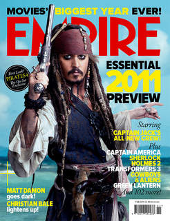
Empire is the master head of this magazine cover. The main image displays Captain Jack Sparrow dressed as a pirate with a weapon in his hand. This not only entices the audience as Johnny Depp is so popular and iconic, but it also displays the genre of the film. The colours are bright and blue, symbolising the sea and contradicting the stereotypes of this particular genre. Bright colours are also used in the anchorage text which tells the reader what is inside of the magazine, enticing them to buy it. This contrasts to the black used for the buzz words 'essential' and 'preview' which make the audience want to buy the magazine as they feel as if they are missing out if they do not. A barcode is displayed at the bottom right of the magazine cover which is essential.
|
