|
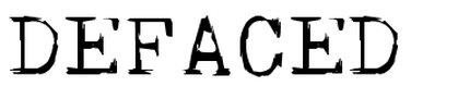
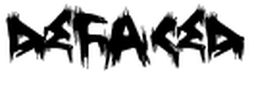
'Skull Type Wr00' is the font we have chosen to use within our trailer. We eventually chose this one to be portrayed in the trailer as we believed this font was able to fit in with the theme in it. Our trailer shows death, torture, injuries and gore and so we thought this font was able to compliment the scenes. The actual font is great for us as it's not cartoony, smooth or bubble writing but instead its simple to read, and it seems like the actual font is slightly slashed up giving a sinister, mysterious and 'missing' feel to some of the text. Great for our horror trailer, which is why we chose to use it.
|
|
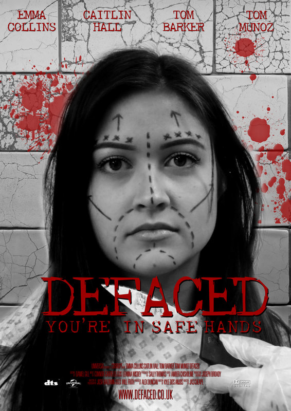
As you can see, we have used this font on our created poster. It looks very sinister and compliments everything else within the poster such as the colour, shape and positioning.
|
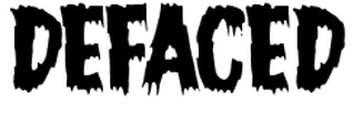
We initially searched for standard horror movie fonts and found this one. However we decided this would not fit in with our trailer as this font looks like the bog standard children's movie horror with no real meaning behind it. We liked the fact it had jagged edges to the text but overall the font was too cartoonish and it's slightly tilted and the bubble writing doesn't work for us.
|
|
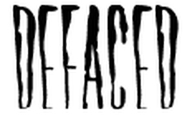
We found this font called 'Horror Hotel' which we thought did look quite good due to the fact it reminds us of blood dripping down a victim after a potential murder. However we then realised the actual text is too thin and clumped together and so we decided not to use it. This is because we wanted our horror movie title to be big, bold and stand out for the audience to really get an idea of what will happen and potentially feel the need to watch it.
|
|
This font seems like it would much rather fit in with a paranormal type horror trailer and not a slasher like ours is. So because of this we decided not to choose it for ours. It would not fit in with our theme of horror and what happens within it. The audience might automatically assume that there would be some sort of paranormal setting.
|
