Audience feedback has been really important in the creation and development of making our horror trailer. We used various methods to obtain audience feedback about our trailer, magazine cover and poster.
The first thing we did was make a survey to assess what an audience thought about different elements and key themes in our trailer. We came up with a list of questions along with answers for the audience to choose from.
THE RESULTS
What word would you use to describe our trailer?
- Creepy /////
- Intense /
- Chilling ///
- Scary /
- Boring
- Yes //////////
- No
- 15-17 ////
- 18-20 ////
- 21+ //
- yes ////////
- No //
- Yes ////////
- No //
- Yes ///////
- No ///
- Yes, but it didn't make it any scarier ///
- Yes, it made it scarier ///////
- No
- Surgeon //
- Victims //
- Weapons /
- Child /////
- Yes ////////
- No //
- Yes, it was interesting ///////
- No ///
- Text //
- Images //
- Layout ////
- Colours /
- Information /
- Text //
- Images /////
- Layout /
- Colours //
- Information
- Yes ////////
- No //
OUR response to feedback before we started the project.
Response -
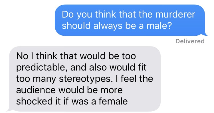
We decided to have the killer as a female as it would be unpredictable and a shock to the audience. This contradicts the classic stereotype that women are weak and should be the victims in horror. A female killer we felt was far more interesting. 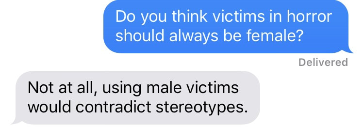
Response -
We decided to use a variety of male and female victims in our trailer. This meant that we were conforming to the stereotype of females being weak and vulnerable as well as contradicting stereotypes, showing how men can also be victims too. This is far more interesting to the audience as it is not something normally seen in horror. |
Response -
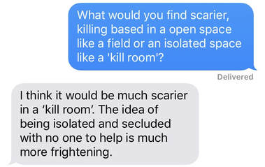
We decided to go with the idea of using a 'kill room'. This is not only secluded thus giving an isolated feel but it also goes well with our surgery theme, the plastic giving a clinical, hospital vibe. Using a isolated location gives the impression of no escape for the victim. 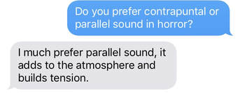
Response -
We decided to use parallel sound in our trailer. We felt this would make it much scarier as we used sounds that built tension and were sinister. We thought that although contrapuntal sound is interesting, it might take away from the gory shots and make it easier to watch which is not what we wanted. |
reaction video for our trailer.
KEY POINTS TAKEN FROM REACTION VIDEO:
- Amber looked quite concerned throughout the video, it's possible she was fearing the outcome of the victims.
- Tyler said "that' s creepy" when he heard the dialogue of the little girl, stating that since we had added this dialogue the trailer had become so much creepier.
- Amber stated that she thought the heartbeat sound was cool.
-Will was quite quiet throughout the trailer, possible out of nervousness but he did nod at multiple shots indicating he was impressed by the trailer.
- Aaron stayed quiet and reserved, this may be out of nervousness.
- Amber laughed at a few points in the trailer, particularly in the more scary parts, again we think this is due to being nervous.
- Tyler also laughed nervously.
- Amber said "that is good" when she watched the shot of the little girls face merge into her as her older self.
- Amber also said "aww" when a montage of the victims dead came up with the dialogue of the little girl, she empathised with the victims.
audience feedback video
KEY POINTS TAKEN FROM AUDIENCE INTERVIEWS:
WHAT THE AUDIENCE LIKED
- The intensity.
- The creepiness of the little girl.
- All audience members wanted to watch the film, with Amber saying she was intrigued to find out what happened to the killer to make her so psycho.
- Killer being female as it is not normally seen in horror and contradicts stereotypes.
- Titles read well with music.
- Cool tones made the trailer more atmospheric and creepy, it was also consistent.
- Best shot being the merge between the killer as a child and an adult.
- The close ups on the victims.
- Varied locations.
IMPROVEMENTS
- Make our genre of slasher more clear as it leans towards psychological.
- Have titles on for longer.
more reactions to our work on social media
By posting our trailer on social media platforms such as Facebook, we have been able to get an audience response and therefore make appropriate changes to our trailer to appeal more to our audience.
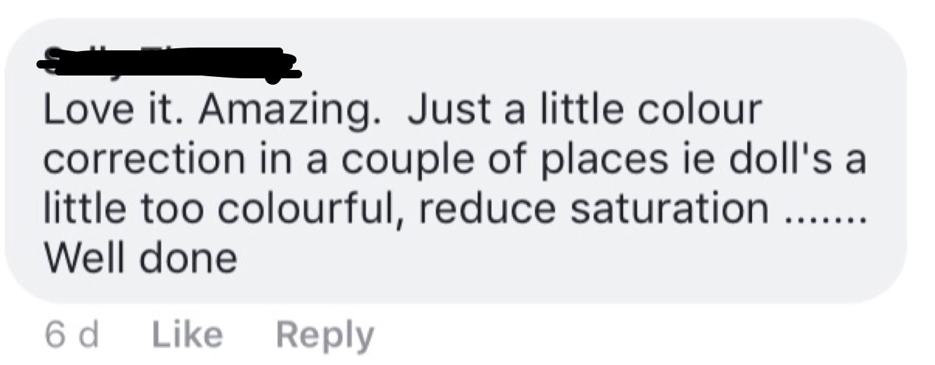
This comment was from an audience member who was clearly a fan of our trailer, calling it 'amazing'. Our reasoning for using high saturation and a cool tones effect was to give a grim and dark look to our trailer. Using dark tones and low key lighting is a key element of horror and gives a chilling atmosphere thus making the audience uncomfortable, so we thought that by including this we would be conforming to horror stereotypes.
However we did agree with the comment that in some places our trailer was perhaps too saturated so have since reduced the saturation.
However we did agree with the comment that in some places our trailer was perhaps too saturated so have since reduced the saturation.
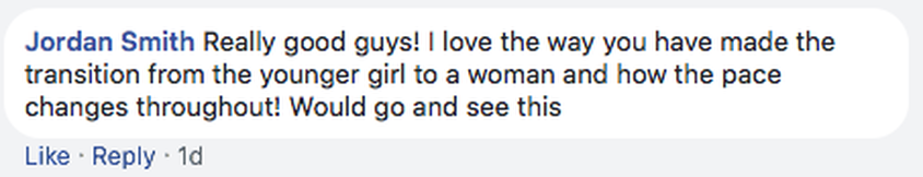
This comment was from a student who studied media, he likes the trailer stating that it is "really good". Like other audience members he was very impressed by the shot of the killer when she was a young child merging into her face as an adult. This gives a bit of context to the story and leaves the audience thinking and making assumptions of the narrative of the actual film. This audience member also liked the pac of the trailer and how it changed and varied, the quick montage style is a classic convention of horror and symbolises madness and gives a frantic feel. It is also crucial that the audience member said he would come and see the film as it is the trailers purpose and a key factor.
Magazine and poster survey
|
|
MAGAZINE EVALUATION |
POSTER EVALUATION |
|
Having an appealing magazine cover was really important to us as it makes up a huge part of the advertising campaign of a film. If the magazine cover is interesting then consumers are more likely to buy the magazine and read about the film and therefore are more likely to watch the film.
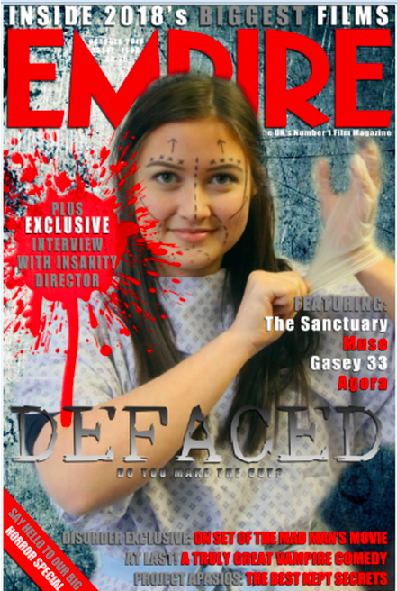
We decided to use the company 'EMPIRE' as our brand of magazine as the logo is already red which symbolises blood so lends well to our theme of horror. The title being so bold and large also means that it is easy for people to notice in a shop, making them more likely to buy the magazine and read about our film. We chose to put some of the smaller, less important writing in grey in order to provide a contrast with the more important information on the cover. We decided to have our title 'DEFACED' in a very large font across the image as if it is large then people are more likely to remember the name and go and find out more about our trailer. We chose to use a smaller text for other information around the magazine cover as it means a customer would have to pick the magazine up in order to be able to read it, and once they have picked up the magazine they are more inclined to go ahead and buy. The image of our magazine cover was important to us as we wanted to find the perfect balance between giving the audience an insight into our film but also not wanting to give too much away. We settled on an image of caitlin with the surgical lines all over her face in a hospital gown, this gives the audience an insight into our film as from this they can gather it to be about surgery but it still keeps them thinking. Our image also stands out and is very eye-catching on the shelf in a shop due to the high-key lighting. To improve our magazine cover we could have included a review or quote of someone who had watched the film in order to further entice the audience. We could have also had a different image and used the image of the killer to give a more sinister atmosphere. Finally we could have used a quote from one of the actresses in the film, as then any fan of the actress would've wanted to buy the magazine and read about the film. |
It was important to us to make a realistic and appealing poster, this is because it is part of the advertising campaign so in order to get people to watch our film we had to entice them with the poster.
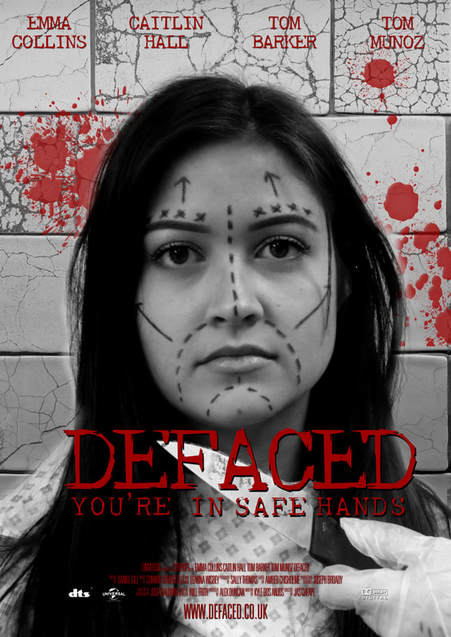
We used different colours in our poster to achieve this. We decided to use red for the title 'DEFACED' as well as our slogan to relate to blood and our genre of slasher. We used and dark background to enhance the red blood symbolism as well as conform to horror stereotypes of dark and dull colours. We also used a variety of font sizes to make our poster realistic. The actors names are placed at the top of the page in a medium sized font relative to other fonts on the poster. We wanted the actors names to be clear as we know from research that may audience members will watch a film based on the actors in it and whether they like them or not, this therefore would maximise our audience. Our main title of 'DEFACED' is the largest of all fonts, making it the centre focus and stand out. We wanted to do this as it is the key element of our poster and gives the audience an insight into what our trailer and film could be about. Our tagline is slightly smaller than out title but is still large so the audience can easily remember it, this too gives an insight into our trailer. Finally, we used very small font at the bottom of our poster with all of the production information as this is what professional real posters include in this style. The image we decided to use was of Caitlin, our victim with surgery lines all over her face - giving the audience an insight into our trailer/film. It also gives the audience an idea of who the killer might be and gets them thinking of possible themes in the film. To improve our poster we could have a background that linked to our trailer better such as a white clinical background which would have enhanced the red font even more so. Caitlin could have also had a more scared look on her face to enhance the fear of the killer and make this obvious to the audience also. We could've also made a number of different posters suitable for different settings for example one to go on the side of a bus etc. |
|
|
|
conclusion
In conclusion, it is clear to us that audience feedback has played a vital part in the production and distribution of our trailer, poster and magazine cover throughout our project as it showed us what appeals to our audience the most. It has been important to us to listen to audience feedback as this is how you increase profit and increase popularity.
Audience feedback has also given us improvements and new ideas had we had the opportunity to do our project again. We could perhaps include some of their ideas such as making saturation more subtle as well as making our titles more prominent. We could have also made our genre of slasher more clear had we redone the project by moving away from the psychological aspect.
Audience feedback has also given us improvements and new ideas had we had the opportunity to do our project again. We could perhaps include some of their ideas such as making saturation more subtle as well as making our titles more prominent. We could have also made our genre of slasher more clear had we redone the project by moving away from the psychological aspect.
