HOW EFFECTIVE IS THE COMBINATION OF YOUR MAIN PRODUCT AND ANCILLARY TEXTS?
Iconic image
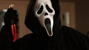
Scream
|
The iconic image in the film Scream is the mask. The mask is instantly recognised and you know that it is related to this film series. The film was released in 1996 and then mask has helped to promote the rest of the series by using this iconic image.
In our trailer we needed to make sure that we used an iconic image so that our film would be remembered. |
|
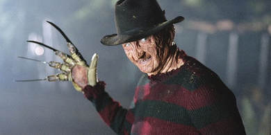
Nightmare on Elm Street
|
In the film Nightmare on Elm street, the iconic image in this film is the murder weapon. The murder weapon is a glove with knives. This stands out because the murder weapon is unique to the film series. Without this the film would not possibly be defined as iconic as a different murder weapon might not fit into in the plot.
|
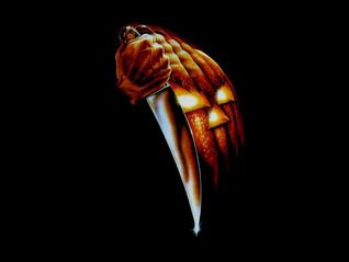
Halloween
|
In the film series Halloween, the iconic image is the knife and pumpkin. When the fans see this they instantly know that the film is apart of this series. The pumpkin is associated with halloween which is an event where people dress up in scary costumes to celebrate ghosts and the dead. The iconic image in this film makes the audience think of the dead and that within the film someone is going to die.
|
|
iconic titles
Star Wars
|
|
Star Wars doesn't particularly have an iconic image but the titles are iconic because there is no other film which has this simplistic but effective font. Everyone can instantly recognise the film by this title because when the film was released the film was so popular that it instantly became the iconic image because it was everywhere, it was on merchandise, posters and billboards. We wanted to keep our font simple because it would look better than if we tried to do a complicated font.
|
Harry Potter
|
We wanted to try a complicated title like Harry Potter because the titles will look a lot more complicated but effective and it might match our trailer more compared to a basic font. This is because our trailer is a more complicated slasher compared to the classic slasher such as scream or Halloween and we think that these type of titles will look better for our trailer. In the titles of Harry Potter the "P" is very iconic as it is vey similar to the scar which is on the main characters forehead.
|
|
Iconic posters
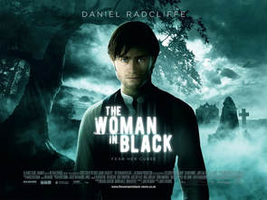
The Woman in Black
|
The poster for the woman in Black is significant because it shows the main actor within the film. you can see that he is alone suggesting that he may be the main character. In the background there is a dark image with a blue/ grey colour which highlight certain features such as a cross and a house as well. With these images being dark it can show mystery as well as fear within the film.
|
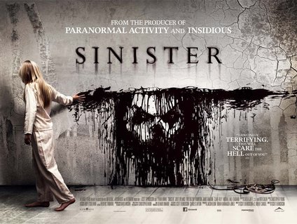
Sinister
|
Sinister is another iconic poster, this is because of the girl running her hand against the wall. The girl running her hand against the wall reveals the face of the killer. The colours used also make the image of the killer stand out more because the colour of the wall is a light grey. The pattern on the wall might also be suggesting mystery, whilst the cracks might suggest the building is old and haunted.
|
|
Iconic magazine
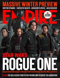
Rogue One
|
One of the most iconic magazines recently has been Star Wars Rogue One, this magazine is quite iconic because the photography used is very simple yet effective. They have used a stand out colour scheme of black, white and red colour theme. The main characters in the photo are all dressed black yet the titles are in a bright white and red colour. The characters in the photo is looking into the camera showing that they don't have must fear.
|
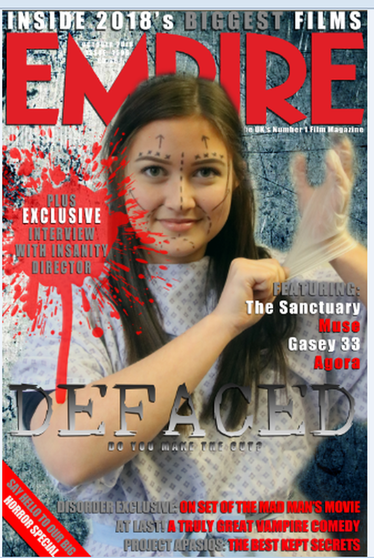
Our Magazine
|
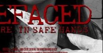
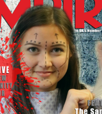
In order for our magazine to be effective we had to use the iconic images and titles, we tried to keep our magazine simple because then it wouldn't over complicate our trailer but at the same time we didn't really want to reveal too much about about our trailer. Keeping the same font in our trailer, poster and magazine allows us to have an iconic part to our productions. If we kept the same font throughout our productions it will allow the audience to easily identify our trailer. The colour scheme which we used was red, grey and white. This is so that the main title on the magazine stands out clearly. The main character on the front of the magazine is standing out clearly because of the colours in which she is wearing comparing to the colours in the background.
|
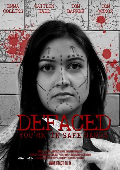
Our Poster
|
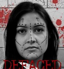
On our poster we used a dark theme, the hair colour on one of our main characters highlights the her face well. Even though we have darkened the photo, her black hair makes her stand out significantly. The bright colouring of one of the most iconic props in our trailer helps make other features within the poster stand out. The red titles not only adds colour to the poster they also help to promote some of the main features which need to be on the poster, for example some of the cast, title and taglines. The colouring also represents blood which can be seen in the background, this also gives the audience a hint as to what may happen in the film. These all help with the overall branding of the our trailer. In the titles there are parts which are missing which may suggest that the victims within the film will have surgery and ultimately get 'defaced'.
|
|
Our Trailer
Iconic font
|
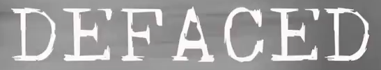
Poster
|
Magazine

|
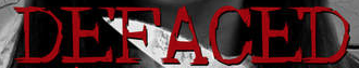
Trailer
|
We had to make sure that all the titles from the magazine, poster and trailer had to be the same because the titles are iconic to our production. The links throughout help the audience to understand that it is all part of the same the group and trailer. If the audience the didn't recognise the titles, which is one of our most iconic ways of recognising our trailer, then they could assume that there is another film called defaced, this is allowing us to have a good branding of our productions.
Iconic prop
|
|
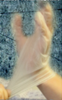
In our trailer there are a couple of props which are iconic. For example the gloves which can be seen on the magazine cover, these are very iconic as there aren't many horror films which use surgical gloves so this may suggest that our killer is trying to be more professional and tidy with her work. The knife is also very iconic to our trailer as this prop is used in many scenes, this is our killers main murder weapon and this also shows that our killer uses a classic weapon.
Iconic characters
|
|
Throughout our trailer, magazine and poster we use the same character. This is so that this character becomes iconic to our trailer and it also doesn't shows the audience too much about our film so they can keep the the idea as to what will happen to one these main characters. From the facial expressions in both of these two shots it shows that she has gone from being happy to having a knife next to her throat. This could be showing that the she may become the main victim within our film.
Dates
|
|
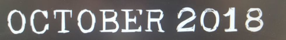
It is important that in our magazine and also our trailer we keep the same date in both. This is because we cant have the audience thinking that there is two different dates for the same release of our film. If the dates were different then this would make both the trailer and the magazine cover look very unprofessional. It is hard to see the date on the magazine cover but the date here is the same aas the date which is displayed at the end of the trailer.
