A poster is an integral part for producing a trailer of a film and the film itself. It provides the audience with an insight into the trailer and what it is all about. It is important that we analyse real posters so we can gain inspiration on what elements to use in ours when we come to create it.
analysing real horror posters
|
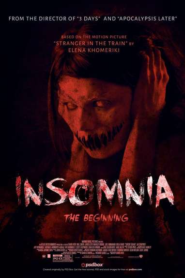
This is the poster for the film 'Insomnia'. The main image is of a possessed, demon like girl. This gives insight into what the film is about, showing the audience the villain in this particular film. The main colours in this poster are black and red, the red represent blood and the black representing death, both key themes in horror films. This contrasts with the main title writing on the poster, which is in white, this is ironic as normally the colour white represents purity. The white does however make the title stand out; this word 'insomnia' is written in a distorted way which once again fits with horror themes. At the top of the poster are names of other films made by the same director of Insomnia and just below gives a description of what the film is based on. This attracts the audience as they may be fans of some of the other films mentioned on this poster, thus attracting them to this film.The poster also features a slogan, in this case "THE BEGINNING" this is a sinister tagline which draws horror audience and fans in. The bottom of the poster then displays multiple credits for the film which again attract the audience who are fans of some of these names mentioned.
|
|
|
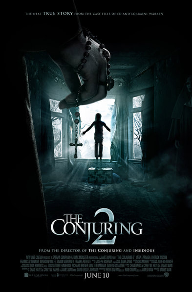
The poster for 'The Conjuring 2' adapts a dark colour scheme with a green tinge, projecting the themes of horror and death.The main image of the poster is a child about to jump out of a window with a hand above her holding a cross, This image says a lot about the film and the themes of religion and possession. The dark colour scheme is a contrast from the white writing which makes it stand out and captures the audiences eye. At the very top of the poster it states that the film is based on a true story which makes the feel of the film seem a lot scarier, it also intrigues the audience to want to watch the film. Below the bold title of 'The Conjuring 2' It states some of the other films the director of this film has produced, in this case 'Insidious' and 'The Conjuring'. This captures the audience who have seen this film and enjoyed them so they might want to watch a film similar. The poster then features a list of credits and finally a bold release date at the centre at the bottom which captured the audiences eye. |
|
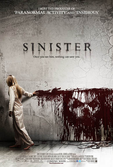
The overall colour scheme of this poster is quite light which contradicts the typical stereotype of horror which is dark and grungy. However this contrasts to the title 'Sinister' which is written in a black/red colour which symbolises blood and death, revealing some key themes of the film. This matched the blood the woman is dragging across the wall, where a face is shown in the blood. This shows some of the characters from the film as well as giving an insight into what the film may be about. At the top of the poster it states some of the other films the producer of 'Sinister' has produced which captures the attention of an audience who may have watched these mentioned horror films and are looking for something similar to watch. There is also a slogan directly under the title which, much like the picture, gives a essence of what themes and topics are raise in the film. At the very bottom of the poster there are a list of credits along with the words 'coming soon' which draws the audience in. There are also small pictures of social media logos where audiences can find out more about the film. |
|
|
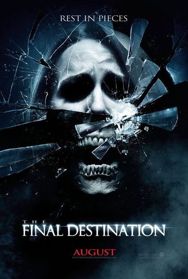
This is the poster for 'The Final Destination' which i feel takes a much more simplistic approach. The main colours are black with a smokey vibe which conforms to the horror stereotypes of death. At the top of the poster is the films slogan which draws the audience in and captured their interest and attention towards the film. The main image is morph of a skull, a woman, and smashed glass which could reveal some key themes as well as the plot of the film. The actual title of the film, 'The Final Destination' is written in white with a glow, this contrasts nicely to the dark background, making it stand out more to it's audience. Then directly at the bottom of the poster their is a release date for the film, in the case 'August'. This is bold and written in red, the red symbolises blood which once again is a key theme in many horror films. |
|
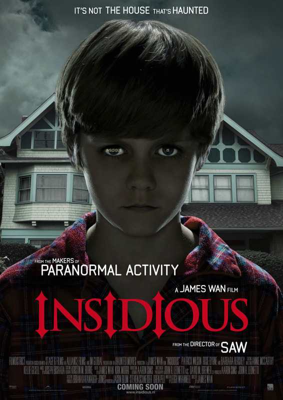
This is the poster for the horror film 'Insidious'. A boy is placed in the middle of the poster, this shows the audience that this is the main character and he is the main focus in the film. This character looks like an innocent child as he is dressed in his pyjamas, however his facial expression tells a different story as he looks demonic. The lighting on this poster is very dark, an effect has also been added to make it more dramatic and dark, this is effective as it intrigues the audience as it creates an eery atmosphere. The title is clear as it is bigger and in a different font and colour, the font used shows a trident like shape which therefore has connotations to the devil showing what sub genre the movie is. Their are other movies added onto the poster as well as to make the audience want to watch it as other popular films were created by the same director
|
|
|
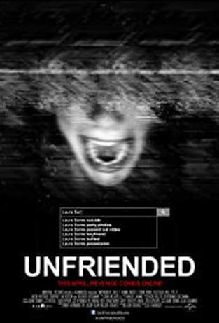
This poster for 'Unfriended', follows the conventions of media due to a face being the main subject of the poster and the dark colour scheme. The black and white effect creates a sinister feel while the static over the girl's face shows how she is not in control of what is happening, its almost as if she's disappearing. The search bar shows a many reasons for why she was 'unfriended' therefore this makes the audience intrigued to see what happened to her and why it did. The release date in this poster is red making it stand out more, this is a good use of this colour as red has connotations to blood and gore therefore it allows the audience to see what the movie will be like.
|
