IN WHAT WAY DOES YOUR MEDIA PRODUCT USE, DEVELOP OR challenge NORMS AND CONVENTIONS OF REAL MEDIA PRODUCTS?
defaced trailer
conventions used
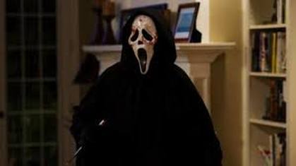
HORROR MISE-EN-SCENE
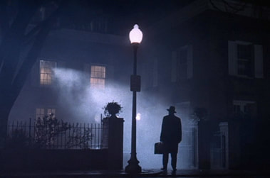
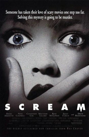
- The conventional use of horror mise-en-scene was used in our trailer, we followed Wes Cravens theory; using the most safest and most relaxed places to set a horror makes the audience fear these stereotypical safe places such as hospitals. We used an isolated areas so there was no help for the victim and nowhere for them to run. This is shown in his movie 'Scream' where a girls parents have left the house leaving her isolated in large house in the countryside, which is the perfect setting danger.
|
|
|
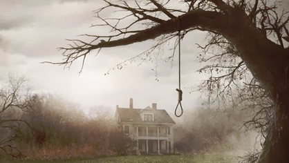
LIGHTING
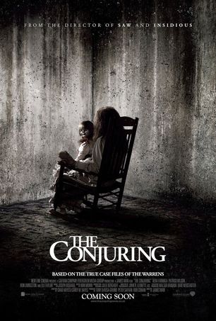
- We decided to use low lighting for most of the shots within out trailer as it gives a more gloomy setting; this also makes the audience tenser. Some of the shots filmed were filmed with natural lighting outside, meaning they did not give the trailer the correct effect; therefore we edited them in post-production and made them significantly darker. However we still kept them lighter than the rest as we wanted to trick the audience into a false sense of safety. We made the decision to not use high key lighting in out trailer as we wanted it to be as dark as possible, this lighting helped to build a personality around the characters by casting shadows across their face creates a sinister feel which was important to us as it makes the audience feel more connected with what is happening. For this convention, we took inspiration from 'The Conjuring' and 'The Cabin in the Woods' as both of these trailers and primarily filmed in the darkness with a few shots in between in daylight.
|
|
|
PACE
- Another convention we used in out horror was the use of pace. We went along with the conventional horror in which it is a slower pace to begin with and the pace builds as the trailer ends. We used this as the build-up of tension makes sure the audience is captured all the way through. We took inspiration from all conventional trailers; however an example would be 'Sinister' or 'It Follows.'
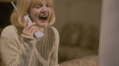
VICTIMS
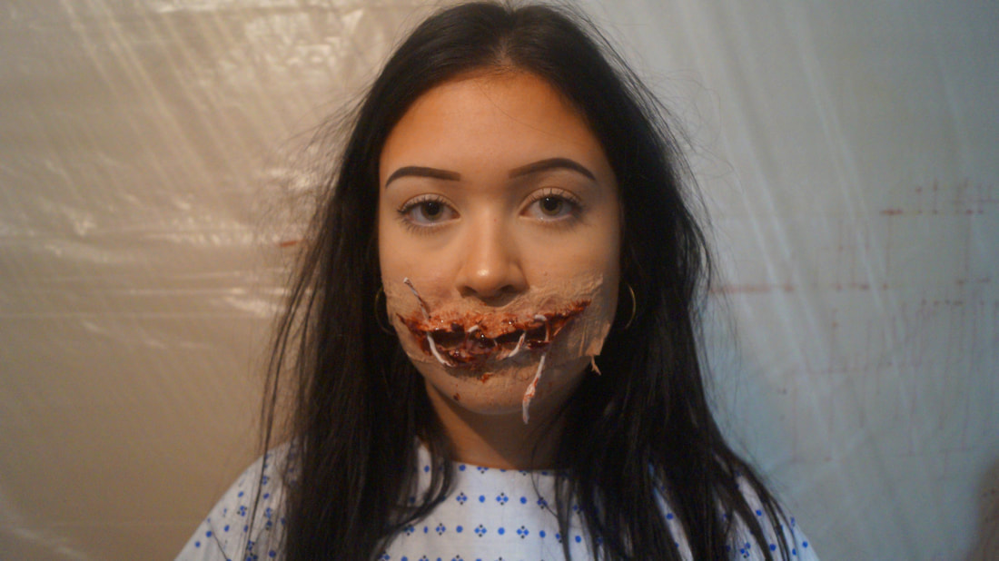
- We decided to use multiple victims within our trailer because we found it important to follow Wheeler Winston Dixon theory that the main sight of activity would be when the victim is killed. This theory means that the audience do not get to know the character well enough therefore they are able to emotionally detach themselves from them. We used this theory as we did not want to overcomplicate the trailer with the victims backgrounds, we took inspiration for the multiple victims from 'The Gallows' and 'Severance.'
|
|
|
developing conventions
NON-LINEAR SEQUENCE
- We decided to have a non-linear sequence for our trailer. We wanted to mix up the shots of the killings to create excitement throughout. For this idea, we took inspiration from the 'Evil Dead' trailer (2013) and 'Pulp Fiction' as there aren't many horror films with a non-linear narrative
FEMALE KILLER
- We found it important to have a female killer in order to create a horror trailer that is not similar to others, many say to have a female killer it is important to have them lure in their victims and still have a feminine way about them. However we made sure that in our trailer this did not happen instead the choice to get the surgery was completely theirs. Creating a 'new' type of female killer
challenging norms
CHARACTERS
- In conventional horrors there is always a stereotypical character in every horror film which is either:
- 'the blonde' - who dies first
- 'the athlete' - who people look to for guidance
- 'the virgin' - the character who survives and is so pure they aren't affected by the evil
KILLER
- Many horror films have a male killer, this is due to Laura mulvery's theory of the male gaze, we found it important to challenge this convention and link more to the female market. Using a female killer added a different aspect to our horror trailer and left the audience wanting to see more as the market is heavily saturated by male killer. We took inspiration for are female killer from trailers like 'Bride of Chucky,' 'Carrie' and 'Jennifer's Body' as all of these movies have female antagonists.
DIALOGUE
- We made a conscious decision towards the end of post-production to have a minimal amount of dialogue in our trailer because I had seen the trailer for 'Hush' and thought it would be an interesting element to add in there. We think that the shots speak for themselves and do not need to be explained with the addition of dialogue. However some was still added as we wanted to make it clear to the audience what had previously happened to the killer to make her this way inclined.
movie poster
conventions used
PORTRAIT POSTER
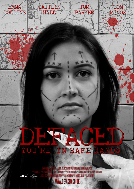
- We decided to go with normal conventions and have our poster portrait. Most movie posters are portrait as it makes it easier for advertising displays before and after they are released, therefore we wanted to copy this idea to give our movie the best chance possible.
DARK COLOUR SCHEME
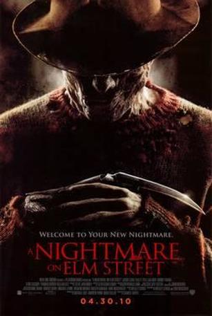
- Many horror posters use a dark colour scheme to create a more haunting effect, as a group we decided to use this convention as we thought it makes the genre of the movie obvious. If we were to use a bright colour scheme and people were to pass the poster quickly they would not be aware that the movie was a horror. We took inspiration from 'Scream' and 'A Nightmare On Elm Street' as both of these posters have a dark colour scheme.
LAYOUT
- We also used the normal layout for a movie poster, where all writing is more towards the edges to avoid it going over the image and distorting it too much. As well as this all of the small details, such as directors and editors is in a smaller print near the bottom of the poster. It was important to us to use the correct font sizes within out movie poster as we wanted to ensure the audience knew what the most important information was, similar to other movie posters.
TAGLINE
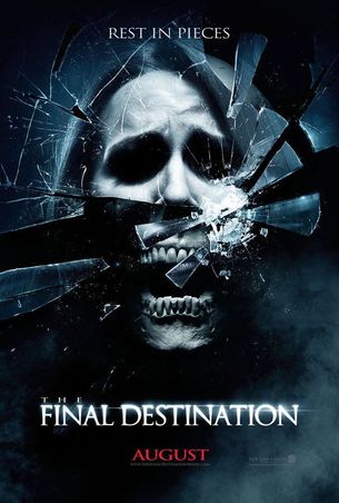
- With taglines we used the same tagline as we used within our trailer 'you're in safe hands' and had this below the main title on the movie poster. This generally follows conventions because all genres of movies have their tagline on the poster. As well as this we went with a simple tagline as we wanted the audience to remember it, out has a sense of sarcasm to it making it more memorable, this idea was based from magazine posters like 'The Final Destination' where there tagline is 'Rest In Pieces'
developing conventions
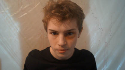
VICTIM
- For our movie poster we decided to use the main victim for the image, this goes against conventions as most horror poster have the killer as their image. However we wanted the audience to see the vulnerability of the victims, as we felt like they would be able to connect with the character more. We found it important to develop this convention as we wanted to connect with the audience more, it also meant that the audience did not know a lot about the killer. For this we took inspiration from the famous 'Scream' poster.
FONT
- Many horror poster have a white font for all of their writing, however we went against this convention as we wanted the poster to have more contrast to make it more eye catching. We also thought the red font with the black and white photo made it more clear to the audience what it says as with white or black writing it would blend to much. The use of the colour red also has connotations to horror, therefore it works well.
challenging norms
WEAPON
- In out poster we decided to show the weapon in it, this goes against conventions as this is never normally done. It also challenges the 'norms' of society as weapons are not normally shown publicly due to different ages being able to see it. However we wanted the knife to be shown as you can not see the killer, therefore we wanted the audience to have some idea of how they kill.
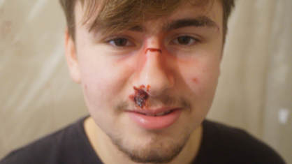
PLASTIC SURGERY
- One of the main challenges to the norms of society in our poster is the fact it can be clearly linked to plastic surgery. Plastic surgery is a type of taboo subject in society, therefore we are challenging the norms by making it clear that the movie is about this. However it can be also said that this is further encouraging the norms as people will be put of surgery, but either way we will get people talking about it.
inspiration
|
|
|
|
magazine cover
conventions used
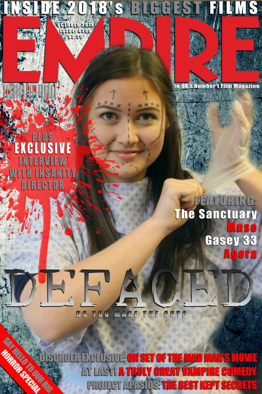
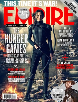
RED ACCENT
- We chose to follow the conventional magazine and use red accents in ours. As you can see we used red as an accent in the cover, we wanted to follow this convention due to the connotations that the colour red had. Throughout our trailer red represents blood and horror, and played a massive part due to our genre being a slasher therefore we thought it was vital to include this. For the rest of the text we used both white and grey because we did not want them to blend in too much with the background. Many movie posters use white as it is clear to see and makes it more professional looking
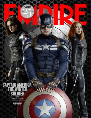
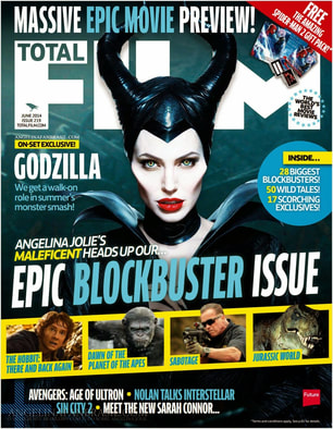
USING ONE CHARACTER
- Many covers only feature one character; we found it important to use this convention as we did not want to over complicate the cover. Using one person makes it clear and does make it look like there is too much on the page, which could have been a problem if we did not follow this convention.
FONTS
- We decided to use fonts seen in conventional covers, it was important to us that we did not stay too far from conventions as we wanted it too look as professional as possible. We used a template for ‘Empire’ to make it seem like it was that company that published it, this main title is the largest font, with our movie title being only a fraction smaller. We wanted to use the correct sizing of fonts in out cover so that it did not look unbalanced and unprofessional.
LAYOUT
- We used the conventional magazine cover layout, we positioned the main title of the magazine at the top of the cover. It was important that we used this layout, having the title at the top of the page allows the customer to see what they are buying easily. Many cover also cut around the models face so because otherwise it would be blocked by the text, this is also commonly seen on magazine covers. Furthermore we positioned all of the writing towards the edges of the cover in order not to obstruct the image. This layout is further explain below in the Prezi.
developing conventions
USING THE VICTIM
- Once again we used the main victim for our magazine cover, as we did not want to give too much away from the killer. This goes against conventions, seen below are covers that feature either the killer or hero. It is very rare to see the victim this is why we wanted to use her again. As well as this it becomes very clear to the audience what movie it is as they will recognise the film from the poster, therefore brand recognition will be greater.
GREY TEXT
- Grey text is common on our magazine cover, we wanted there to be a strong contrast. This is developing conventions as many movies only use white, we wanted to make ours different from the rest to make it stand out more.
inspiration
|
|
|
|
